Torch Log Service
Torch Log Service


Document

- Documentation
 Torch Log ServiceUser GuideVisualizationSummaries of query and analysis chartsPie chart
 Copy page
 Download PDF
Summaries of query and analysis charts
Pie chart
Copy pageDownload PDFPie chart
The log service provides pie chart to show the log query analysis results. This article introduces the configuration of various chart parameters.
Diagram description
The pie chart is used to represent the proportion of different categories, and the difference in proportion between categories and the numerical difference of each category compared to the total sum are compared by radians.
In the logging service, pie charts can be displayed by the following types.
- Pie chart . Default display for the ordinary pie chart type, two-dimensional display.
- Circular diagram . In contrast to the pie chart, the ring chart has a hole in the middle, each category is represented by a segment in the ring, and the data for each category makes up the entire ring. The ring chart can display the corresponding proportion of each part in multiple data sets. When comparing multiple data sets, comparing through multiple ring charts is more intuitive than multiple pie charts.
- Nightingale rose diagram . The Florence Nightingale diagram is a circular histogram in polar coordinates, also known as a polar diagram. Each classification data is divided equally by the arc, and the size of the data is represented by the radius of the arc. The Nightingale rose chart has the following advantages over the pie chart.
- It is suitable for scenarios with multiple categories. When there are many categories, such as more than 10 categories, the Nightingale rose chart will have a more intuitive display than the pie chart, and it is not easy to identify the smaller categories when there are many pie chart categories.
- The numerical comparison is more intuitive. In contrast to the size of the pie chart's comparison sector, the Nightingale Rose chart amplifies the differences in values between various categories of data, and even comparisons with values of similar size will perform better.
Notice
- When using pie chart display, it is recommended to limit the amount of data returned through the limit syntax, for example, by specifying that 10 pieces of data are returned. In this case, the pie chart displays these 10 pieces of data in 10 sectors.
- When there are more than 5000 categories, only the data of the first 5000 categories will be displayed, and the remaining classification values will be aggregated into other categories.
- Before using the analysis chart, please read Precautions .
Common configuration
Configures a statistical chart of the specified type globally, with effect for the entire chart range. The common configurations supported by pie charts are as follows.
Interactive event
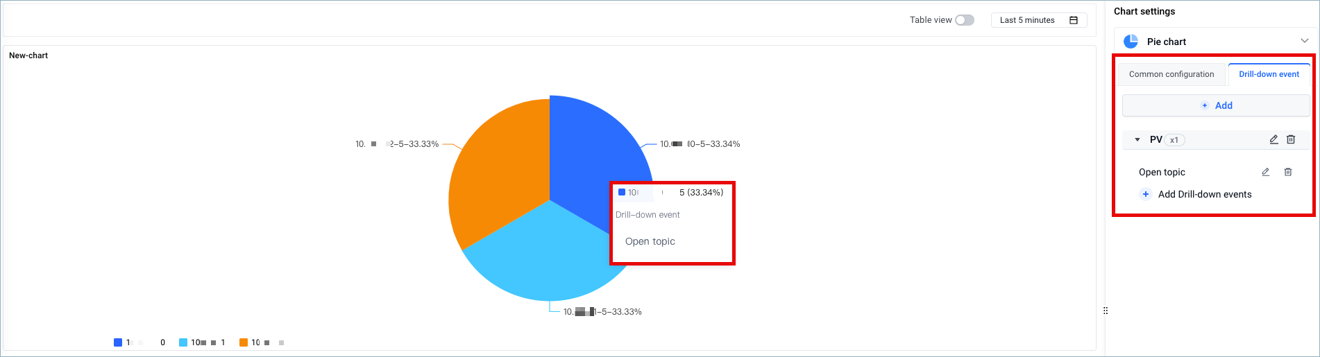
In interaction events, you can set the interaction effects of analysis charts in the dashboard. After setting, clicking on a specified field in the dashboard will trigger the corresponding interaction effect. Currently supported interactive events include open log topic, open dashboard, and custom HTTP link. For detailed descriptions of each interactive event, refer to Add charts to dashboard.
For example, set interactive events on the PV column. If you set the PV column Interactive Events to Open Log Theme , you click any sector in the pie chart and then click Open Log Theme , and the page will automatically jump to the log theme you set.
Example
The pie chart shows the proportion of the number of requests from each request method to the total number of requests.
- search analysis statement
-
- chart settings
- Classification field : Specify as Method . Method Represents the request method.
- Value : Specified as PV . Count requests by COUNT (*) as PV.
- statistical chart
-
Last updated: 2026.01.08 11:21:35
All rights reserved © Beijing Volcano Engine Technology Co., Ltd2024
