Intelligent Data Insight
Intelligent Data Insight


- Documentation
 Intelligent Data InsightDataWind User GuideDashboard Construction and ViewingMobile EndMobile Layout
 Copy page
 Download PDFCopy pageDownload PDF
This product provides mobile features, allowing users to flexibly configure mobile layouts. If mobile layout optimization is not performed, dashboards created on the PC will, by default, use a fixed size, fluid layout when viewed directly on a mobile device. To provide a better user experience and more diverse mobile presentation effects, this product offers mobile layout configuration capabilities, enabling users to independently design the presentation layout and effects of dashboards specifically for mobile devices.
Common application scenarios
- Enhance the mobile data consumption experience: Avoid issues such as oversized metric cards or charts that are too wide and become difficult to read due to adaptive scaling in the default layout, thereby improving the design and aesthetics of the mobile interface.
- Build a management-focused cockpit: Fine-grained mobile layout configuration enhances the experience for managers, making it easier for multiple levels of management to focus on key metrics. Core metrics and specific charts are arranged logically, allowing for targeted information delivery and improved efficiency in accessing critical information.
Step 1: On the PC, open the dashboard that requires layout adjustment and enter edit mode.
Step 2: On the edit page, click the mobile phone icon in the upper right corner to enter mobile layout mode.
Step 3: On the PC, you can manually drag and adjust the layout on the canvas. After adjustments are complete, click Save and view the result on the mobile device.
Caution: After saving the mobile configuration, any operations performed on the advanced dashboard on the PC (including format adjustments and chart deletions) will not take effect on the mobile side. To apply these changes to the mobile side, you must manually enter the mobile layout page and add them from the left panel.
3.1 Chart editing
In the editing canvas in the middle of the page, users can adjust the chart format.
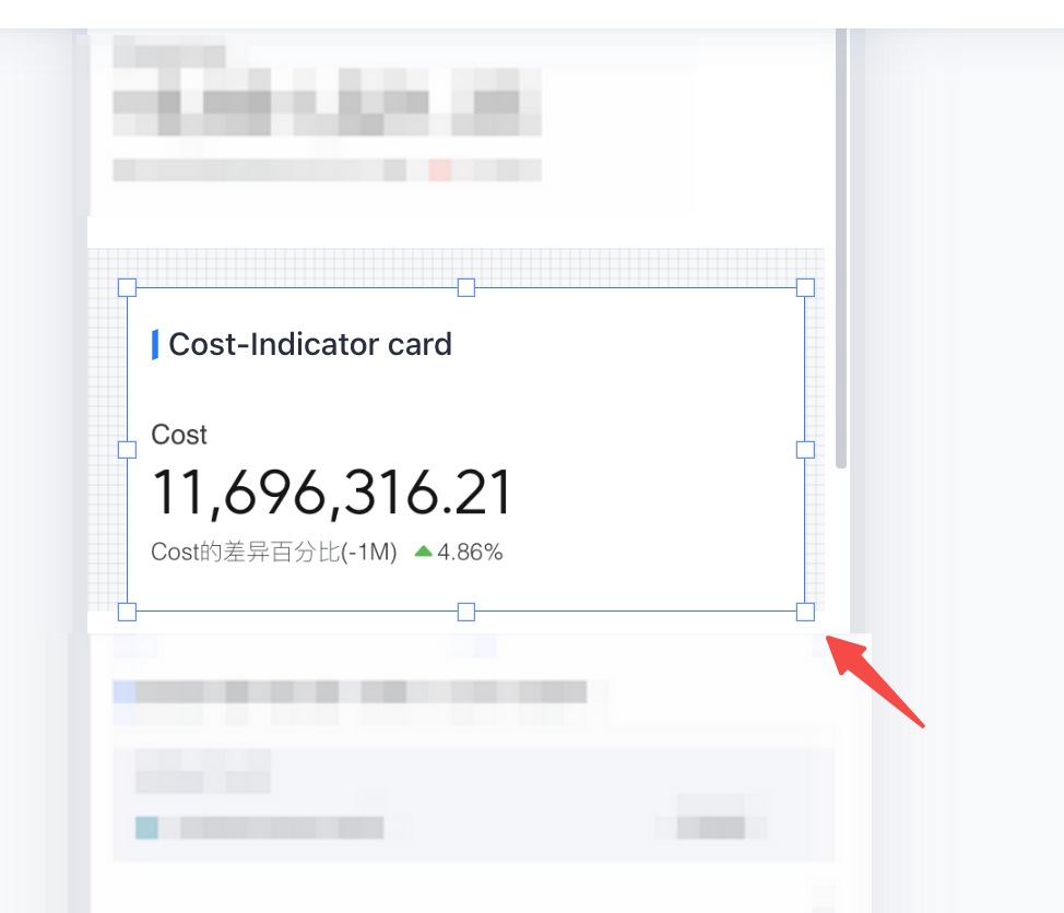
- Select the chart and drag it to adjust its placement.
- Click the border and drag to adjust the chart size.
3.2 Chart/image settings
The user can format the currently selected chart.
- Chart title: When "Show title" is selected, the chart name is displayed, and the title font size and color can be adjusted.
- Indicator style, line style, display mode, and more: Depending on the chart type, the configuration options specific to the chart will be available for adjustment.
- Transform: Adjust the chart position (X, Y) as well as the chart width and height.
- Appearance: Adjust the chart background color, corner radius, border color, and border thickness.
- Anchor: After enabling, you can set the chart position as an anchor, making it easier to locate the corresponding position on mobile devices.
3.3 Layer adjustment
The user can drag to adjust the component layer order.
3.4 Component deletion and restoration
The system provides two ways to delete components:
- Select the corresponding component on the editing canvas and click the delete button in the upper right corner.
- In the layer list on the left, click the preview button to hide the component.
The user can click the preview button again in the layer list on the left to restore the hidden component.
3.5 Anchor settings
Set quick-jump anchors within the page to help readers quickly locate content. Click the chart that needs to be set as an anchor, enable the anchor in the chart settings area on the right, and an anchor will be generated on the page. When the user selects this anchor, the page will automatically jump to the location of the current chart.
Modify the display name of the anchor.
3.6 Tab page settings
To adjust the mobile layout, use the tab page component and click the "Dropdown" button to view all current tab pages. When the target tab page is clicked, the selection panel will collapse and switch to the corresponding tab page.
3.7 Pager settings
Users can configure a pagination control for the table. After enabling the pagination control, click the "Left" or "Right" indicator to select the previous or next page, or click the page number area to bring up the pagination overlay, then select and jump to the corresponding page.
